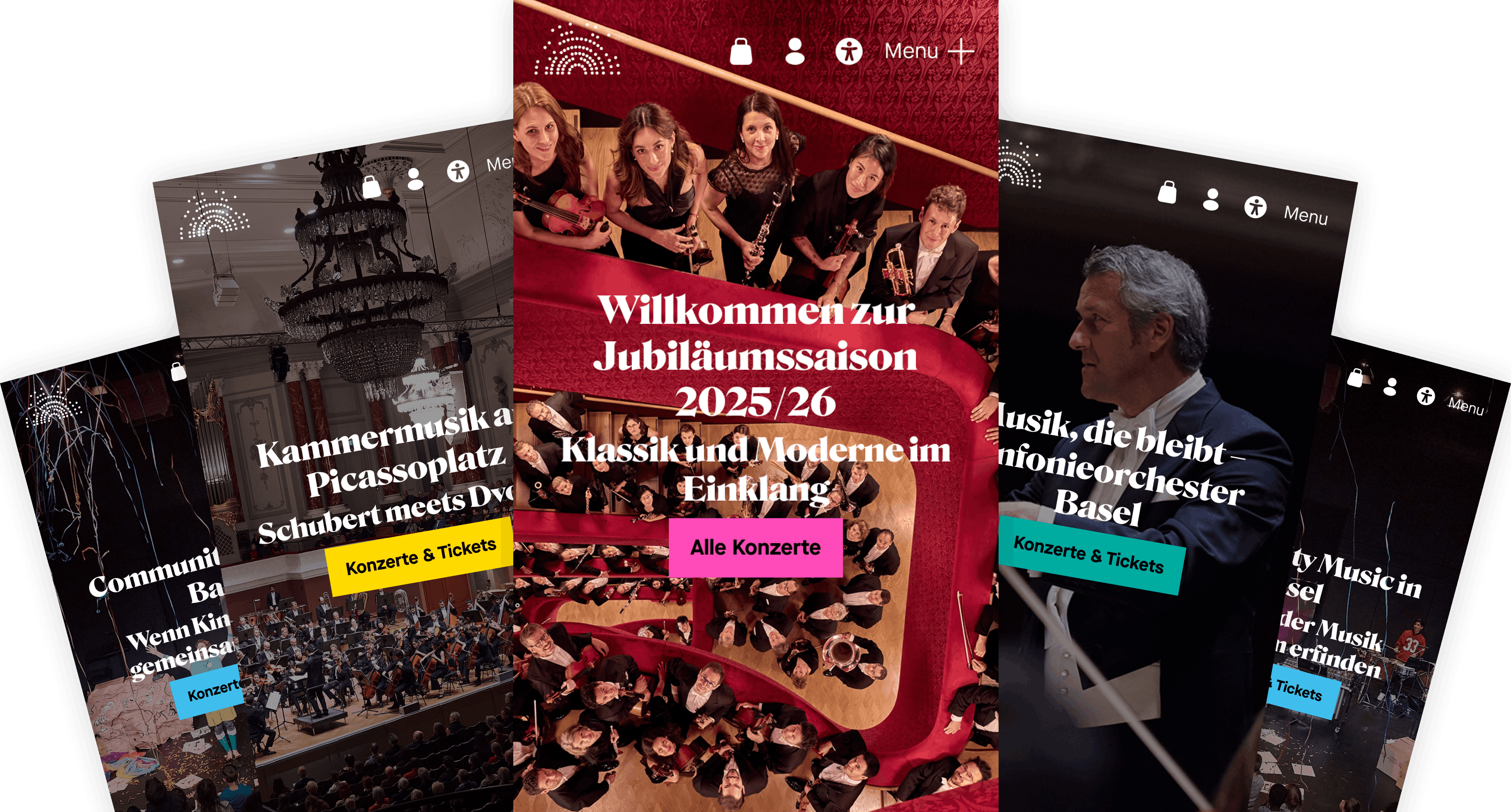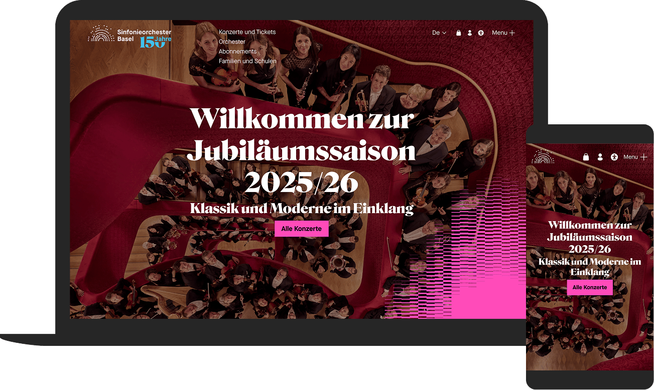
To mark its 150th anniversary, the Basel Symphony Orchestra was given a new digital presence – visually redesigned based on the corporate identity developed in collaboration with Daniel Ranz – and built to be practical for day-to-day use. As an internationally active orchestra with strong local roots, the Basel Symphony Orchestra performs at various venues in Basel and the surrounding area and caters to a wide range of audiences. The relaunch also marks a transition: Markus Poschner will succeed Principal Conductor Ivor Bolton from the 2025/26 season onwards. The website was designed to make ticket sales easier whilst clearly communicating the orchestra’s artistic vision and educational work (from nursery school to youth), in a way that is accessible and intuitive.

A clear overview of the programme
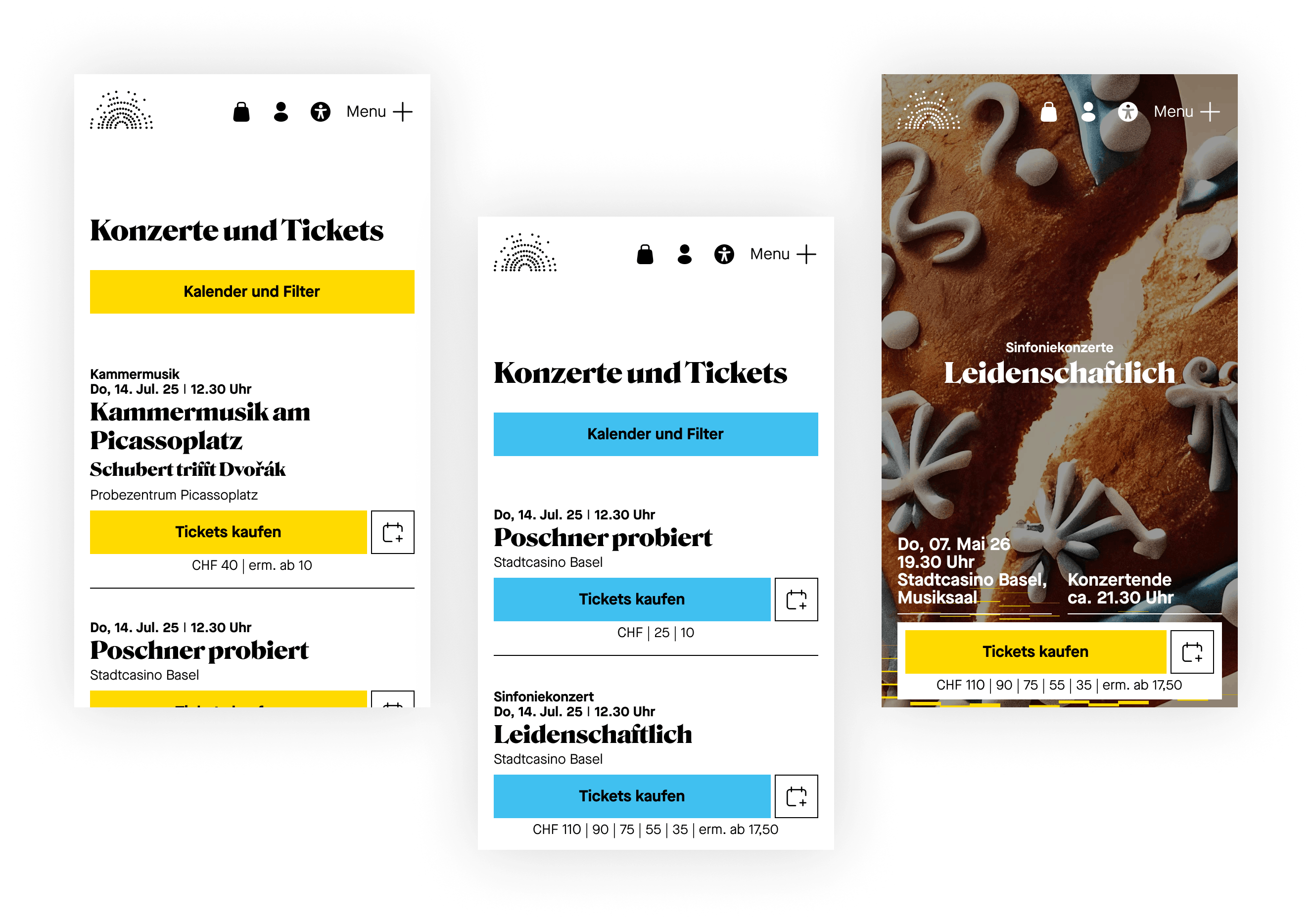
The opening is deliberately kept simple: the event list does not include photos, thereby reducing cognitive load, particularly on the ubiquitous smartphone. Instead of ‘scroll noise’, it relies on clear typography, precise information and a structure that quickly leads users to the date, venue and programme. Important: Ticket purchasing is integrated into the calendar flow; the path to the shop feels like a seamless next step, not a switch to a separate system. The UX decisions were validated through analysis, click tracking and workshops – including clear priorities in the navigation (Children, Orchestra, Concerts/Tickets, Subscriptions).


Subscription offers: clearly explained, easy to compare
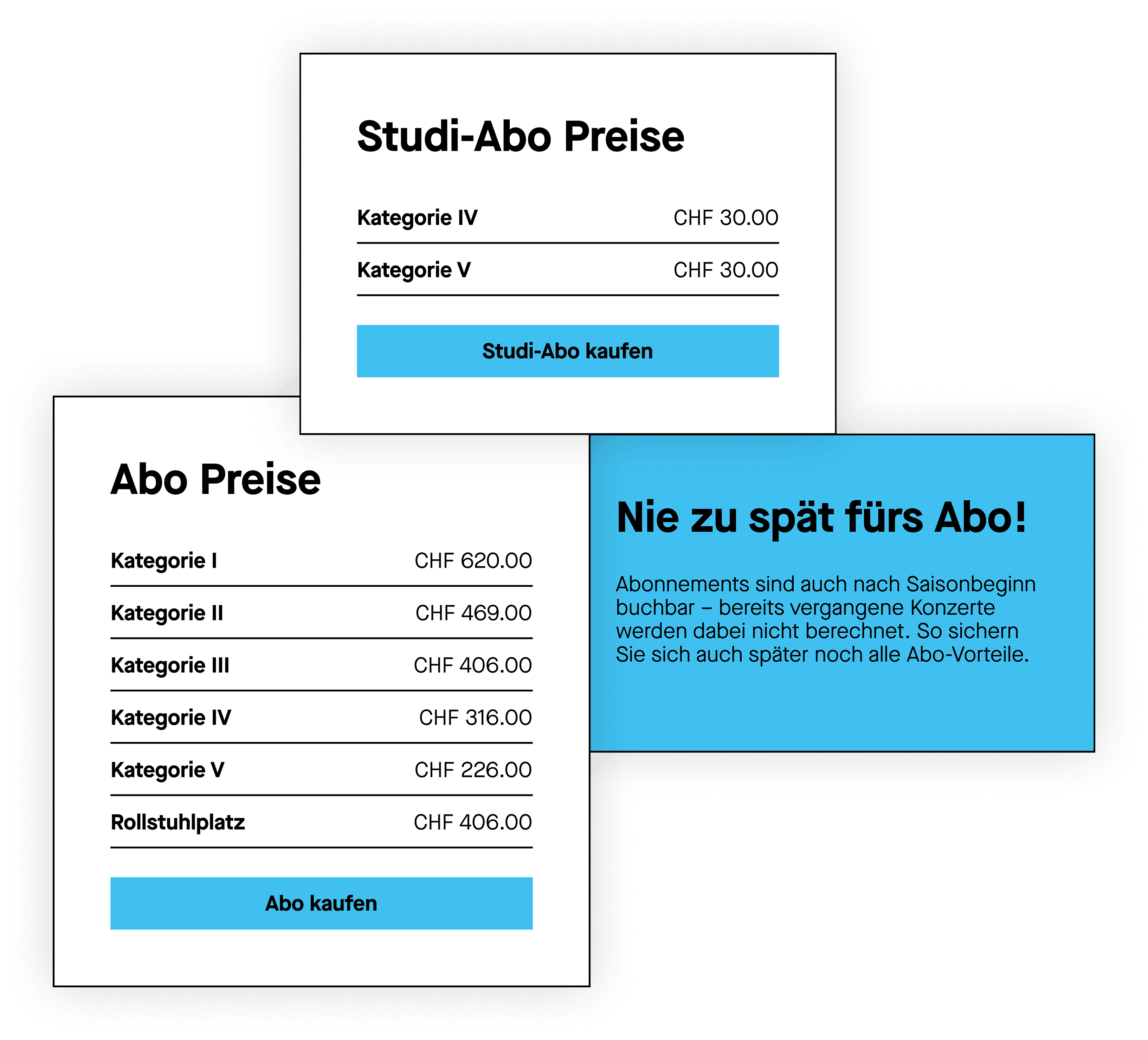
The season ticket packages have been revamped, simplified and better tailored to the needs of today’s target audiences. On the website, they are presented and explained in such a way that visitors can quickly understand and compare them without having to trawl through PDFs or lengthy information texts. At the same time, the path from season ticket information to the relevant concert listings remains short, ensuring that season tickets do not come across as a ‘by-product’ but rather as a convenient way to get the season off to a good start.
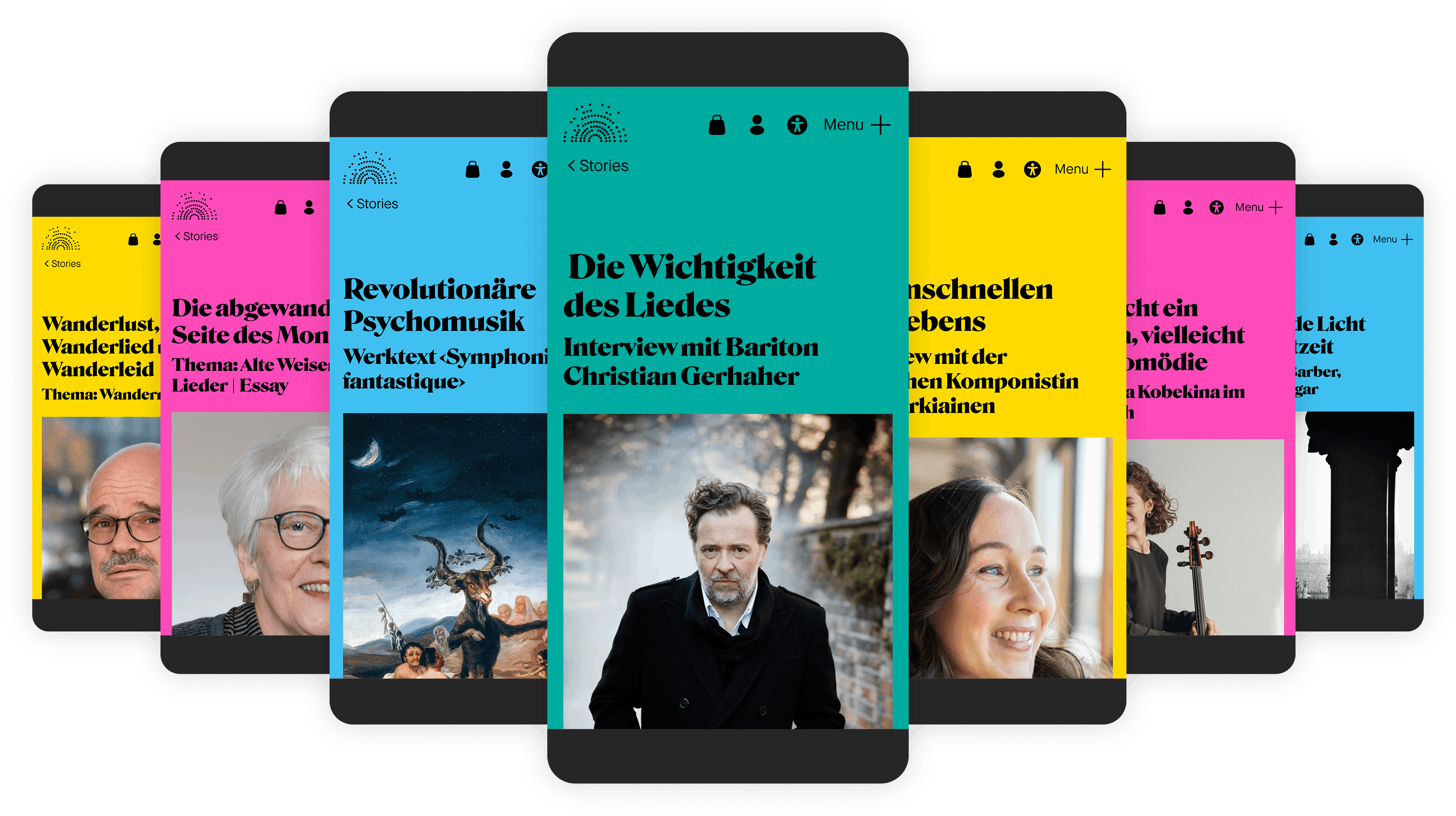
Stories as a second stage
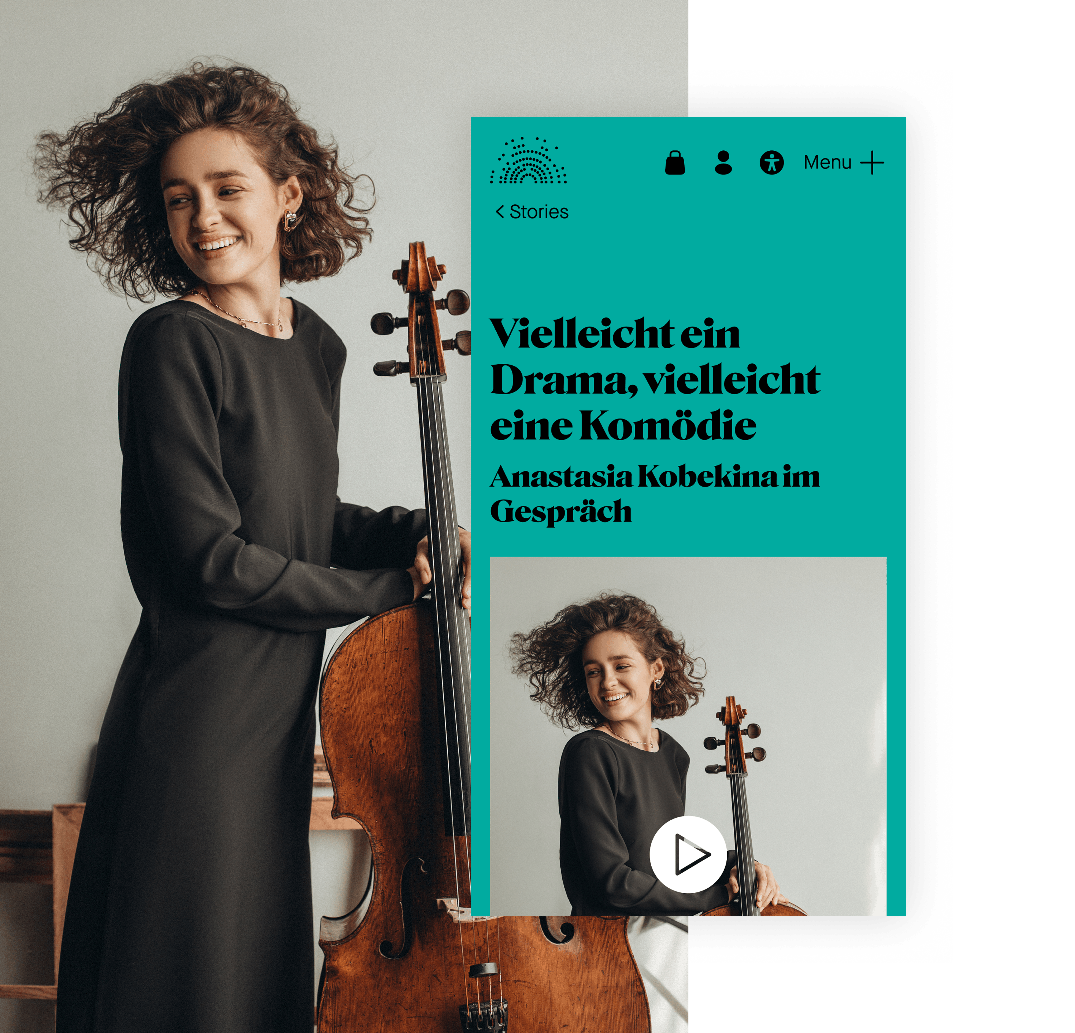
Stories broaden the perspective beyond the concert evening itself: rehearsals, background stories, musicians, projects and, where appropriate, links to educational initiatives. This allows readers to get to know the orchestra not just through its repertoire and line-up, but through the people, processes and themes that shape its sound and identity. The aim is not simply ‘more content’, but greater connection and context. Those who read up on it understand more quickly what an evening represents and can then find their way back to the programme. It is precisely this blend of editorial depth and clear user guidance that makes the experience accessible to people with different interests and levels of knowledge.

Summary
Technically, the relaunch is based on a bespoke Django backend (4.2) and a Nuxt frontend with page modules, which significantly speeds up editorial work and content management. Opas-Next provides data on dates, programmes and cast as a ‘single source’; Secutix supplements this with prices, availability and ticket status via API, ensuring that information and the purchasing process remain integrated. Accessibility is implemented system-wide (font, contrast, colour scheme). The key visual – the amplitude sketch – has been prepared as an animated signature and is being continuously expanded through micro-animations and page transitions; session-based colour schemes ensure a subtly changing experience after go-live. Result: The redesign and simplified shop integration led to a significant increase in ticket sales at the start of the season.
-
Client
Sinfonieorchester Basel
-
Project
www.sinfonieorchesterbasel.ch
-
Duration
8 months (Go Live 1 / Final product: 12 months)
-
Go-Live
March 2025
-
Team
1 Project Manager
1 UX Designer
1 UI Designer
1 Frontend-Developer
1 Backend Developer
1 IT Operator -
System Environment
OPAS Next (Distribution Software)
Secutix (Ticketing- & CRM-System)
Python/Django (Backend Webframework)
Nuxt (Frontend Webframework)
Celery (Task-Management)
Sentry (Error Tacking)