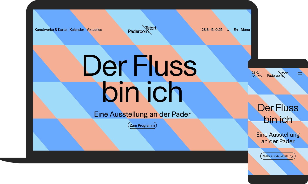
Tatort Paderborn is a temporary art exhibition in public space. For 2025, a digital platform was created under the motto ‘I am the river’, which provides orientation, sparks curiosity and translates the new appearance into an intuitive user experience – before, during and after the festival phase. The corporate design was developed by AG Grafik and forms the creative basis of the website. The website was designed to be accessible to a diverse audience, editorially controllable and flexible to maintain. Motion design elements bring the new look to life and make the character of the project digitally tangible.
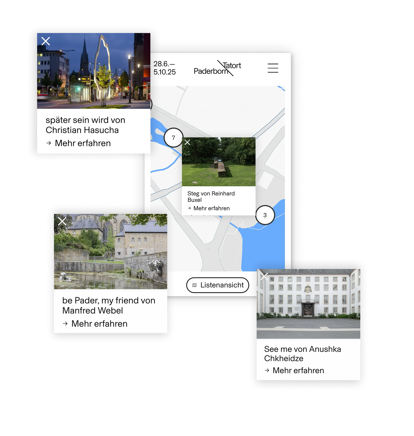
The map as a stage
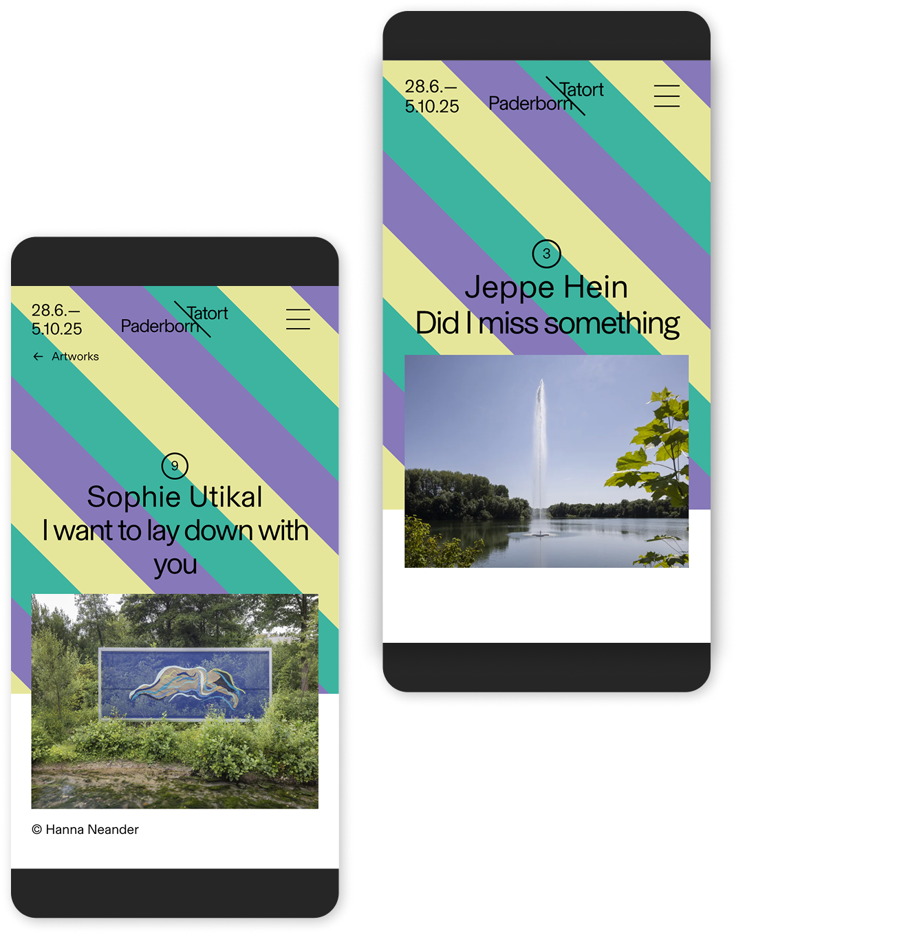
The website consistently tells the story of the exhibition from the perspective of the Pader. An interactive map locates all the artworks along the course of the river and branches out into routes, contexts and formats. Content, navigation and motion follow the river dramaturgically – modular, responsive and always with the aim of making exploration as easy as possible. To match this, the logo also symbolises the course of the River Pader, anchoring the main theme in the very first visual impression.
A central element is the festival mode with three operating states: ‘before the festival’, “during” and ‘after’. So it is always clear which phase you are in and the site displays the corresponding content. Navigation to ‘Works’ and ‘Map’, ‘Calendar’ and ‘News’ remains permanently accessible via the header and burger menu.
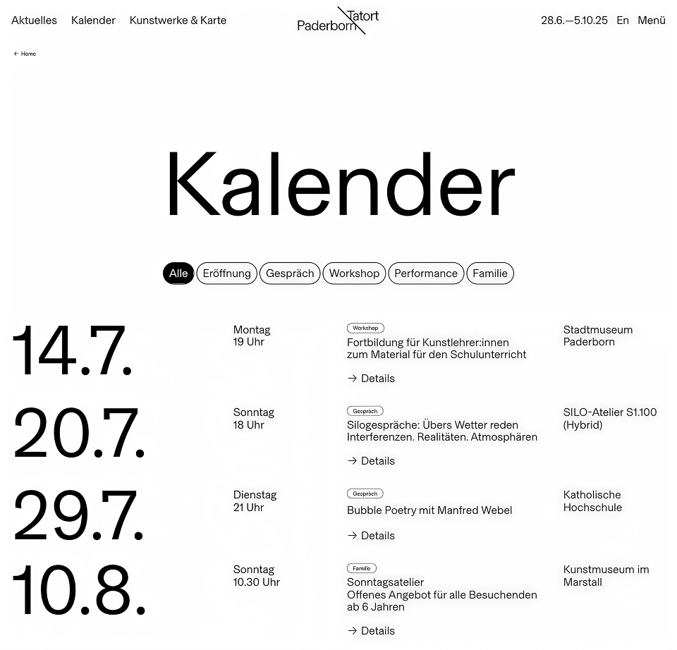
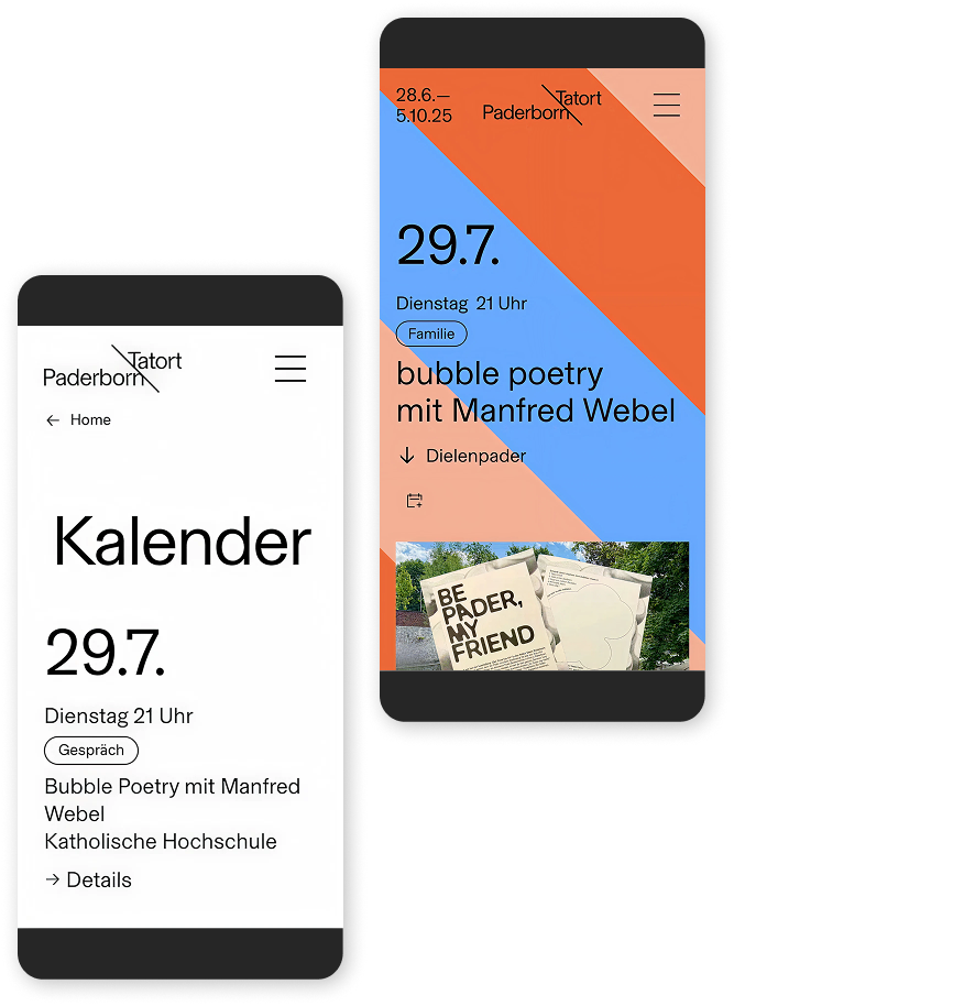
Dates, tours, meetings
Accompanying the exhibition, an event calendar highlights the many formats: exhibitions, guided tours, workshops, walks or tours. Events can be discovered via calendar views, filters or thematic tours and are closely linked to the locations and works, so that individual dates quickly turn into a day along the Pader.
Summary
Tatort Paderborn was implemented as a modular system with individually configurable colour spaces, layouts and transitions. The platform functions as a digital counterpart to the real urban space: phase-conscious, map-based and editorially flexible. The whole thing is complemented by a magazine section that creates space for essays, interviews and documentary depth, making the project comprehensible beyond the festival period.
-
Client
Gemeinnützige
Ausstellungsgesellschaft
Paderborn mbH -
Project
www.tatort-paderborn.de
-
Duration
4 months
-
Go-Live
Spring 2025
-
Team
1 Project Manager
1 UX Designer
1 UI Designer
1 Frontend Developer
1 Backend Developer
1 IT Operator -
Systemwelt TBC
Python/Django (Backend Webframework)
Nuxt (Frontend Webframework)
Celery (Task-Management)
Sentry (Error Tacking)
